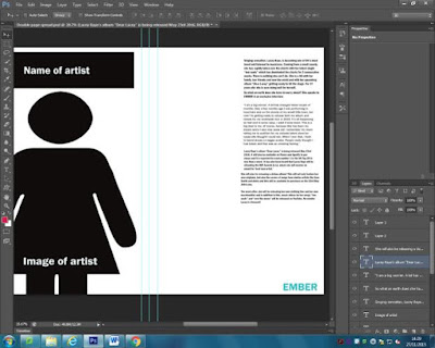
In today's lesson I planned my double page spread. I began with writing my interview plan so I was aware of how much space I needed on my double page spread for my text. I also needed to ensure that I didn't write too much nor too little. I then decided to plan my double page spread by using stickers on Photoshop to place things on the page. I feel I have successfully planned my double page spread because I decided where I wanted my images and where I wanted my text on the page so when it came to placing it once I had my images and my full text, I knew where to put everything - I didn't waste time. I also decided to change my left page as instead of the initials of my artist, I wanted to have an image because it would look more interesting and appealing. Despite this, for my final product, I did end up changing my double page spread slightly as I wanted 4 images on my double page spread and not 1.

No comments:
Post a Comment